


1
2
3
4
5
6
7
8
9
10
11
12
13
14

CLIENT:
The Learning & Engagement Department at the Denver Art Museum is chock-full of experts in community programming. They are always brainstorming ways to better communicate with kids and families who visit the museum. As a result of their efforts, the Denver Art Museum is frequently praised for its accessibility and universal appeal. In fact, access and inclusion are two of the museum’s strongest brand standards: All visitors are welcomed, regardless of age, language, or education level. As one employee explained to me, “We never want people to think that they aren’t the ‘museum type.’ We never want them to think that they aren’t smart enough, or educated enough, or worldly enough to contemplate and appreciate art. Art is for everyone.”
ASK:
Two members of the Learning & Engagement team approached me to create a family-friendly guide to the museum. In addition to the traditional museum guide, they wanted something that would speak to kids and families. They asked me to highlight kid-friendly exhibitions, activities, and events, and to include some sort of interactive element within the guide. I knew the project would get a lot of eyes, because the museum gets a lot of visitors: During the 2016–2017 calendar year, there were over 870,000 total visitors, including over 200,000 kids ages 0–18. My job was to craft something beautiful, functional, and informative—something that could be translated into multiple languages and made available to hundreds of thousands of museum visitors.
PROCESS:
As a graphic designer, it’s exciting and rewarding to have a project that is almost purely altruistic. The Denver Art Museum offers free general admission to all youth ages 18 and younger, so my goal with this project was not to squeeze more money out of families through ticket sales or gift shop purchases, but instead to do something a little less quantifiable—to help families engage with art.
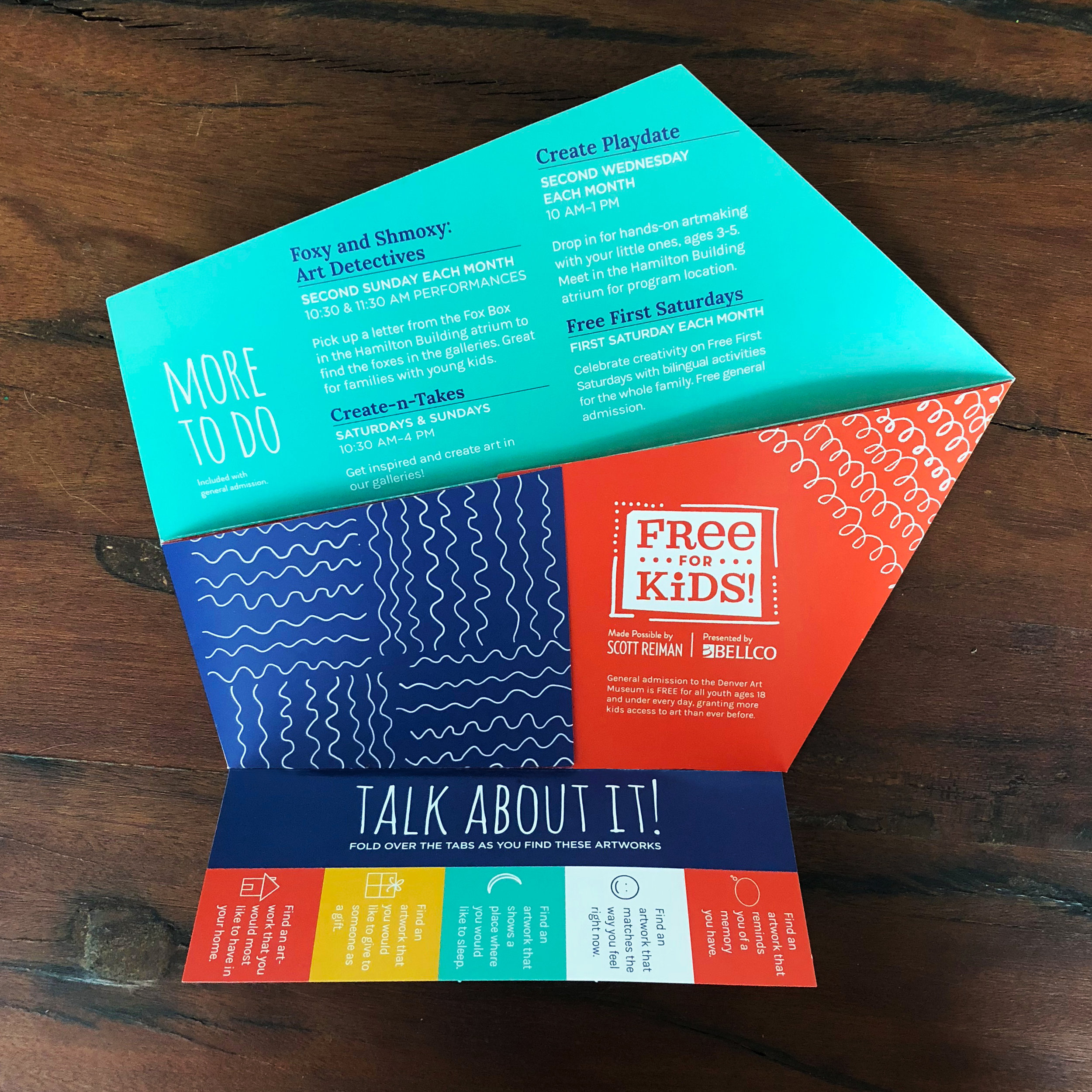
A graphic designer who had previously worked at the museum had started a collection of inspirational materials from other museums of a similar size and nature (Seattle Art Museum, Portland Art Museum, High Museum, etc.), and I used those materials as a starting point. The idea was to make something that folded in a different way than the traditional brochure. The previous designer had sketched a guide in the shape of the museum—a dramatic, jagged Libeskind building that has become an iconic part of the Denver landscape. I worked from this initial sketch. I chose an energetic color scheme with rich primary colors and paired it with shapes that I drew in Illustrator. For titles, I used an organic font with a handmade feel. I coupled this with a thick serif for subtitles and an easily readable, round and open sans serif for body text. For the interactive portion of the guide, I designed a series of tear-off prompts that kids could use to find and discuss artworks.
SOLUTION:
The final product was an angular, geometric museum guide based on the Hamilton Building at the museum. The cover features an illustration of the building, so you know exactly what you’re looking at. The bright colors, hand-drawn elements, and playful fonts appeal to younger audiences and spark a sense of adventure. The guide folds out into five panels, including one panel with tear-off questions and conversation starters for kids. Here you can see a fall/winter version and a spring/summer version of the guide.