HUMAN NATURE event identity 🍐🌿🍊
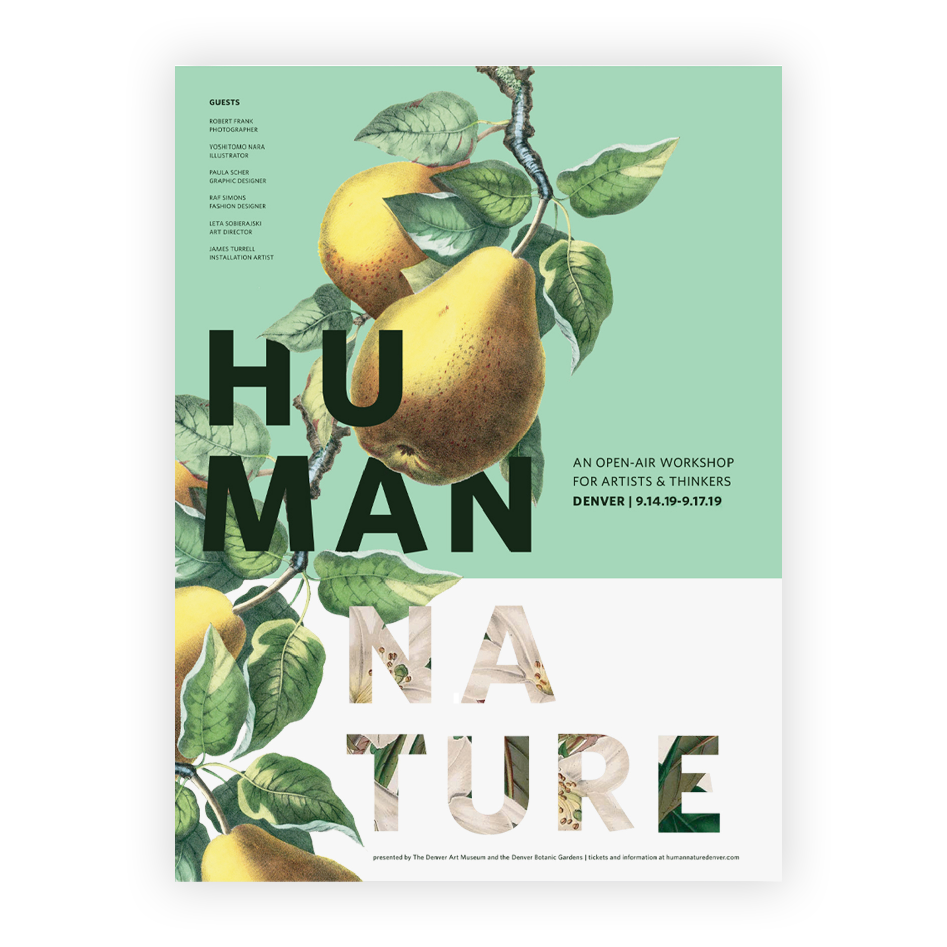
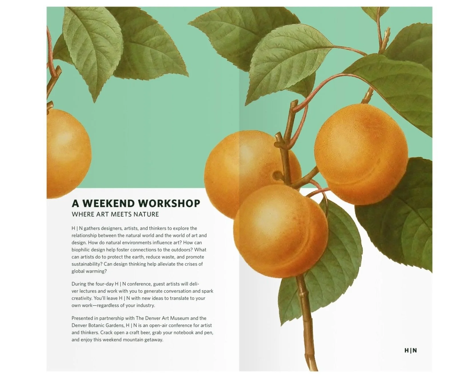
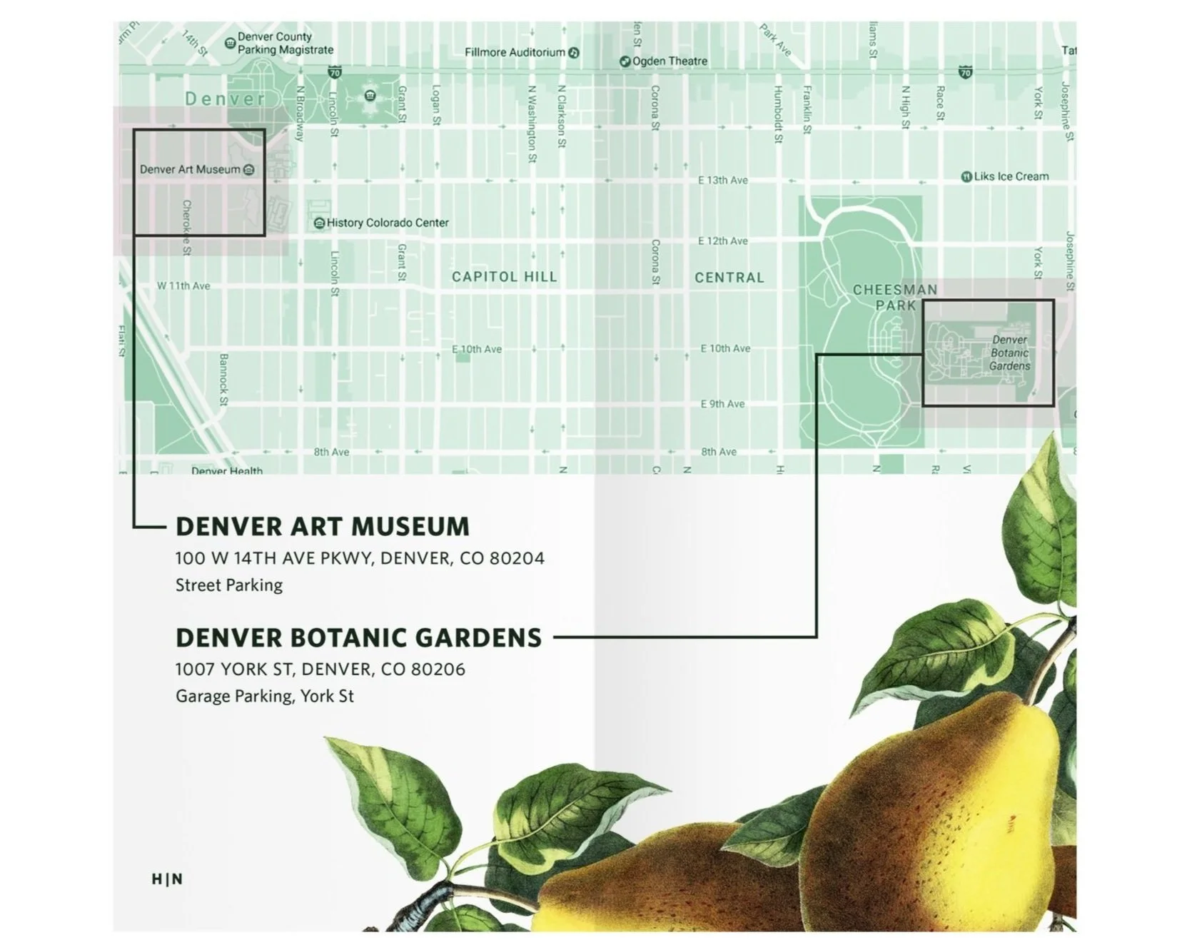
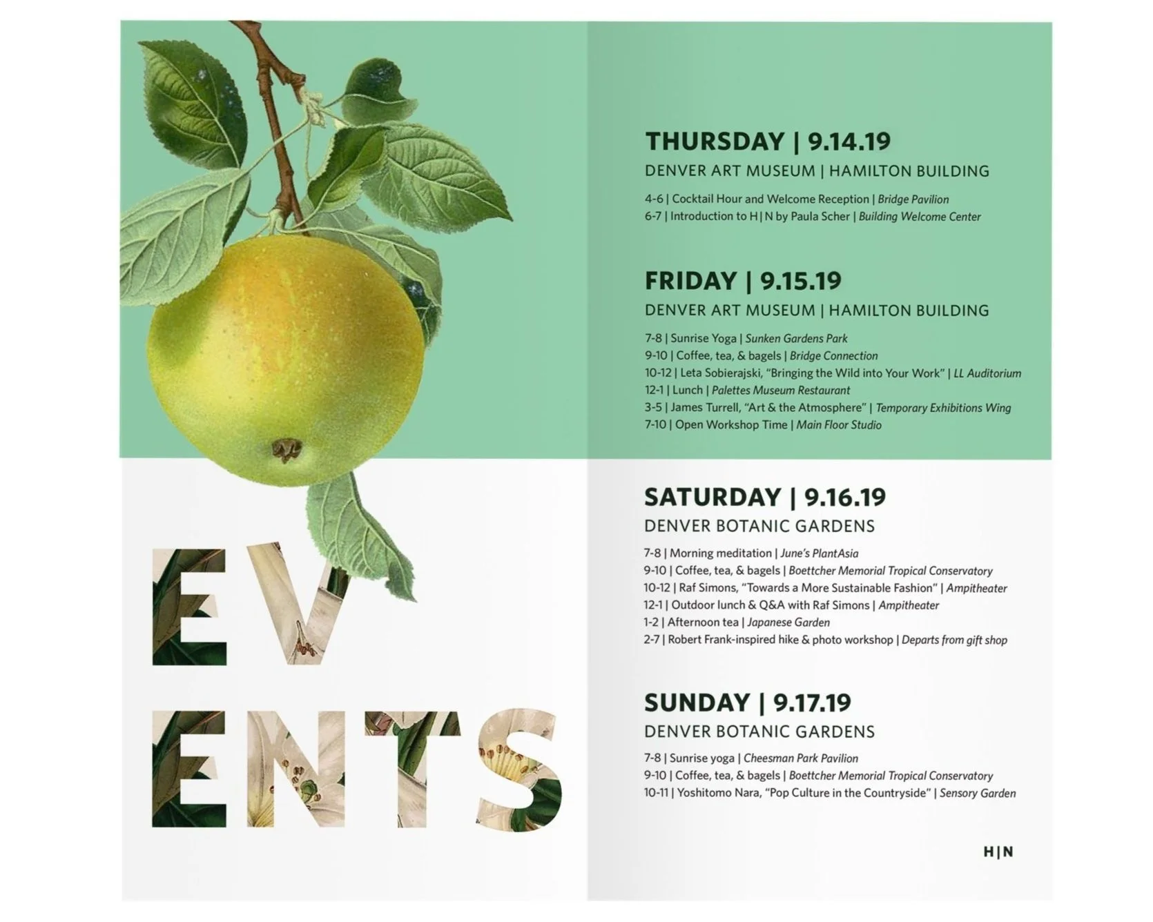
A student project that turned out to be one of my favorites. “Human Nature” is an imagined concept for a Denver artists’ workshop combining art and nature. Below is an event poster along with three spreads selected from an accompanying event brochure.
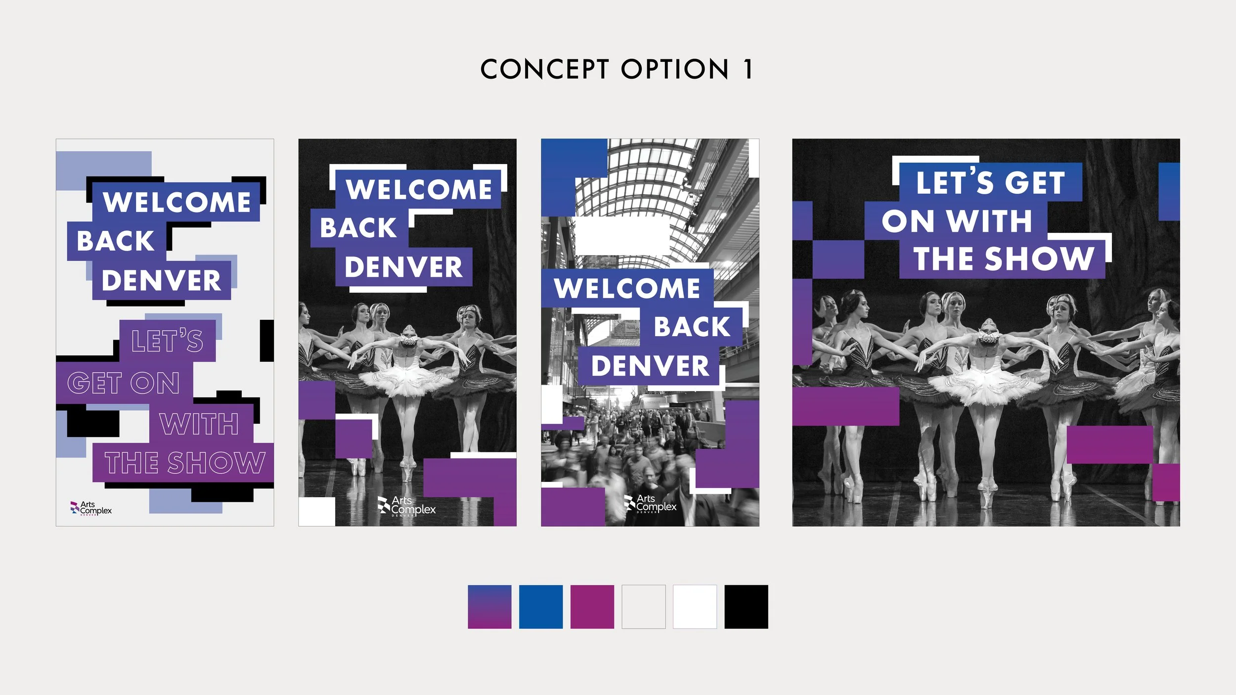
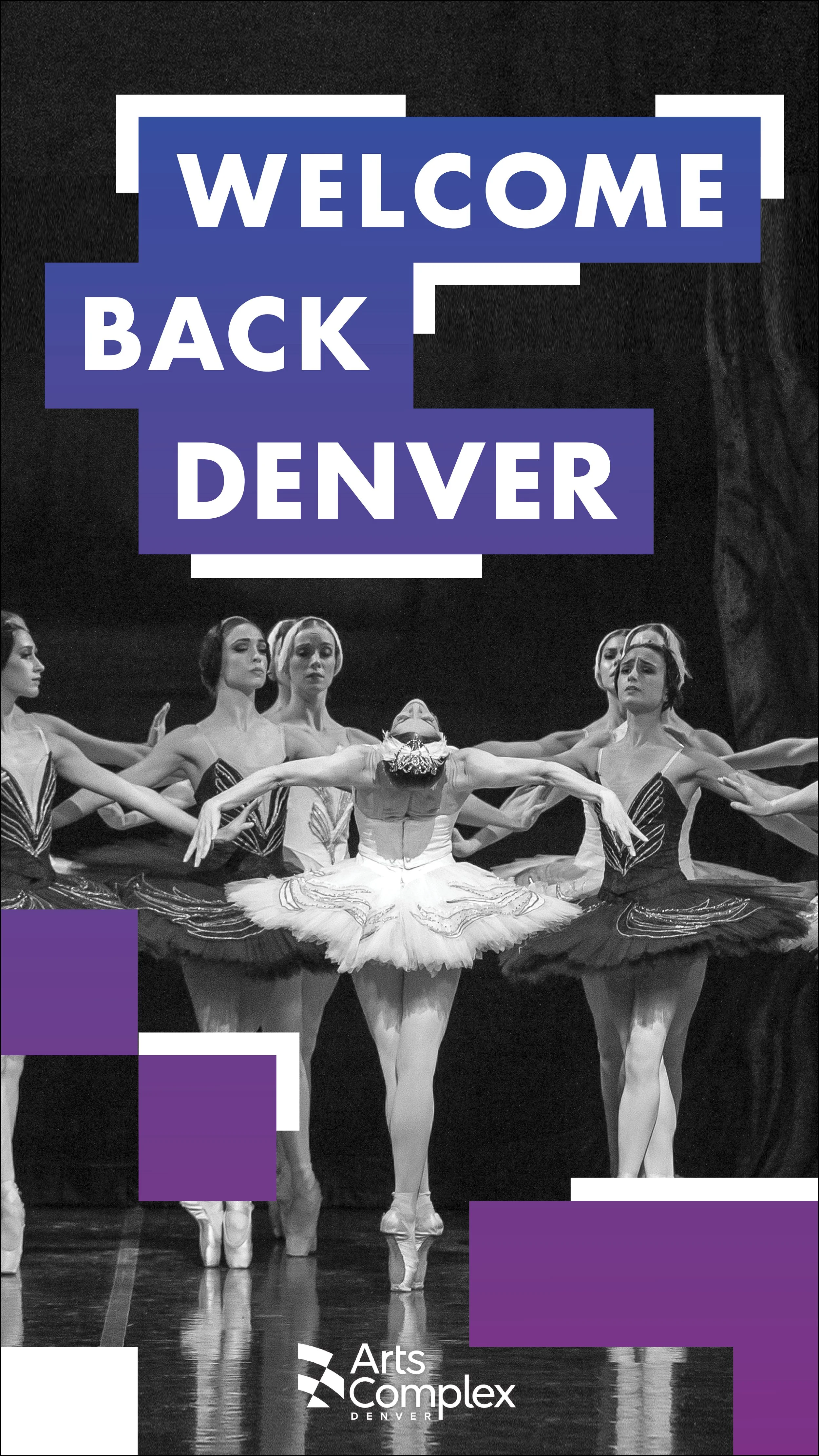
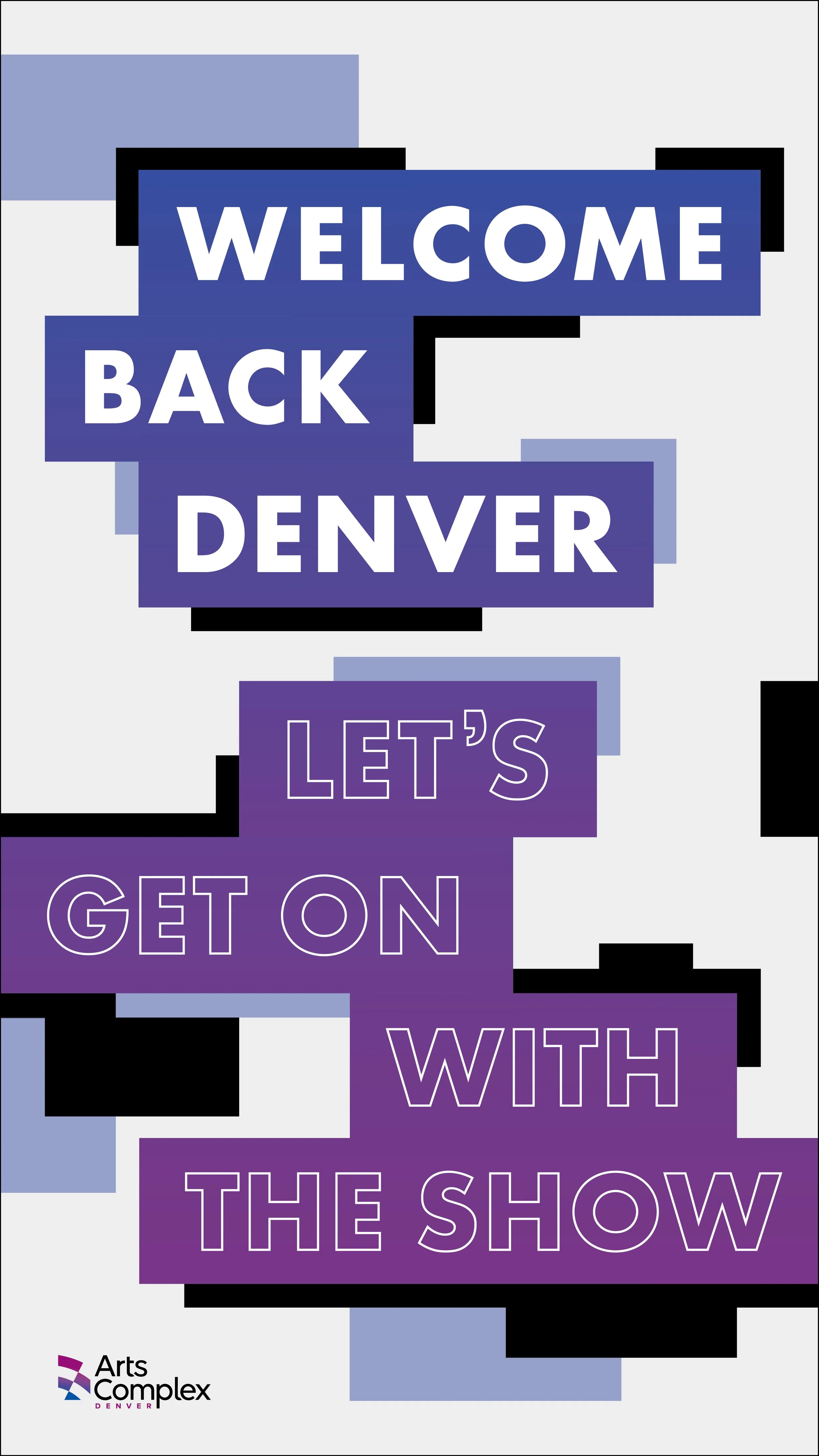
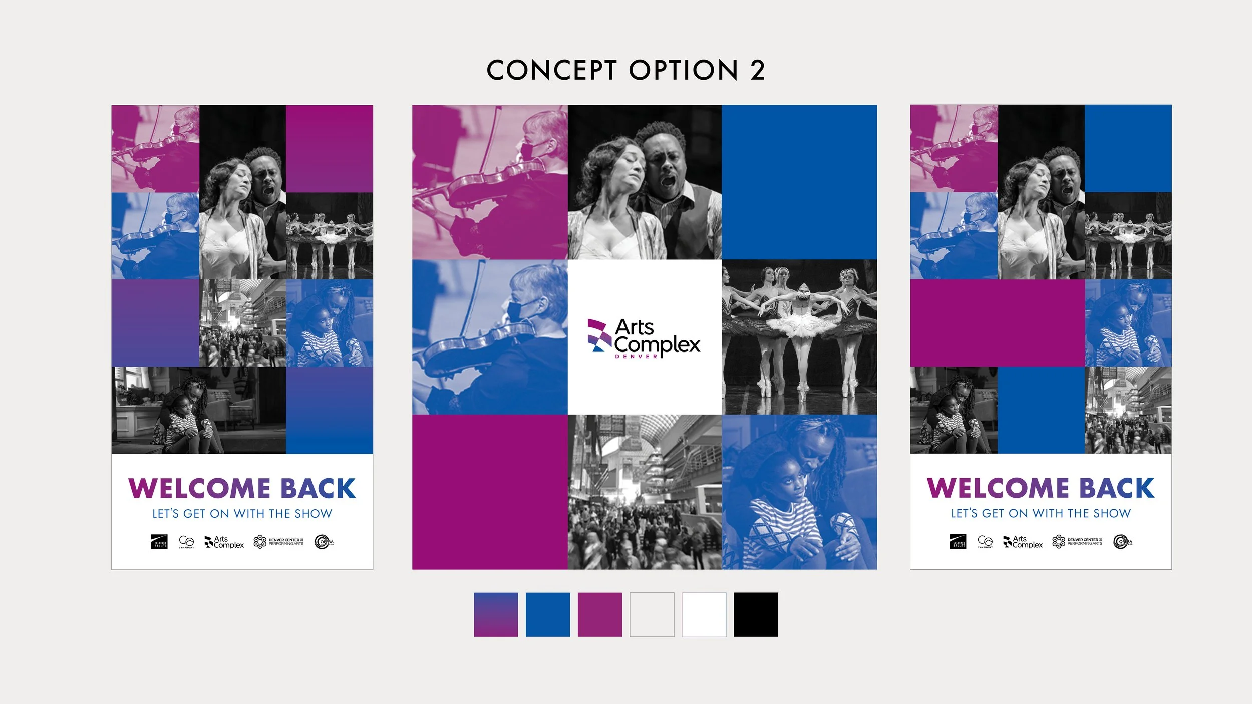
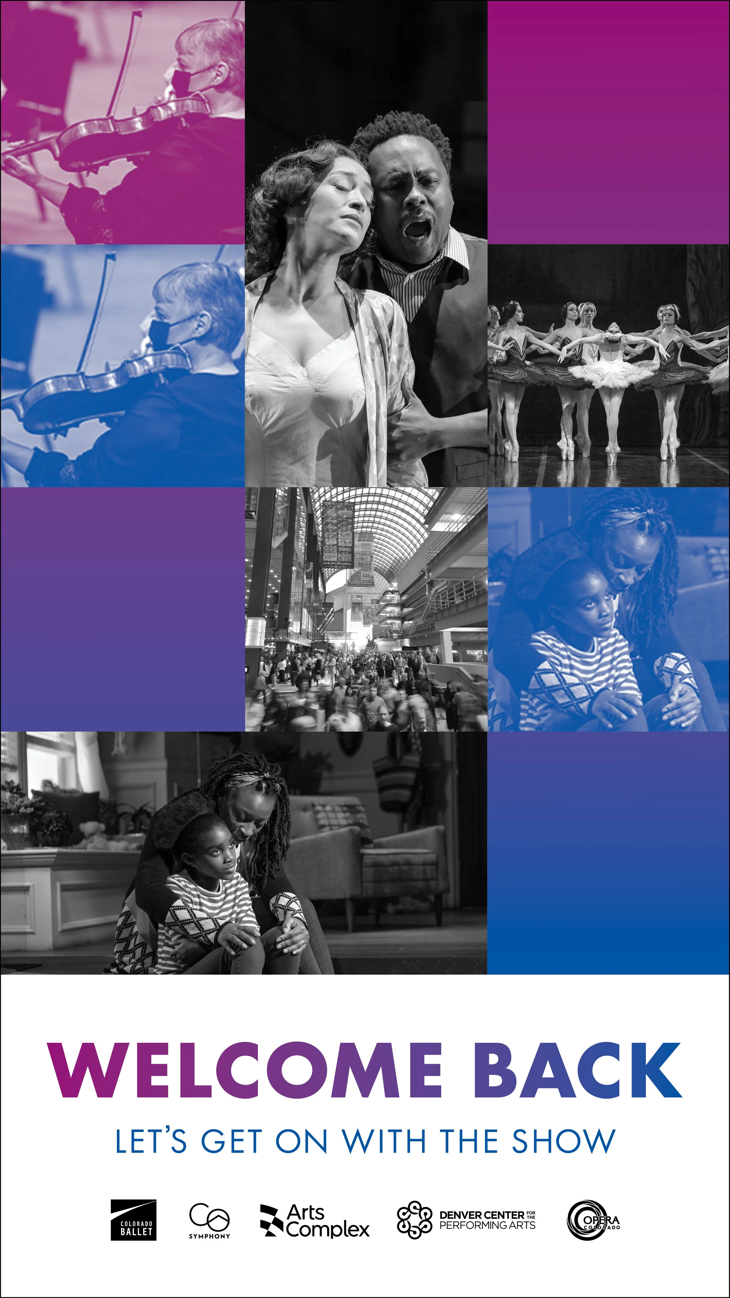
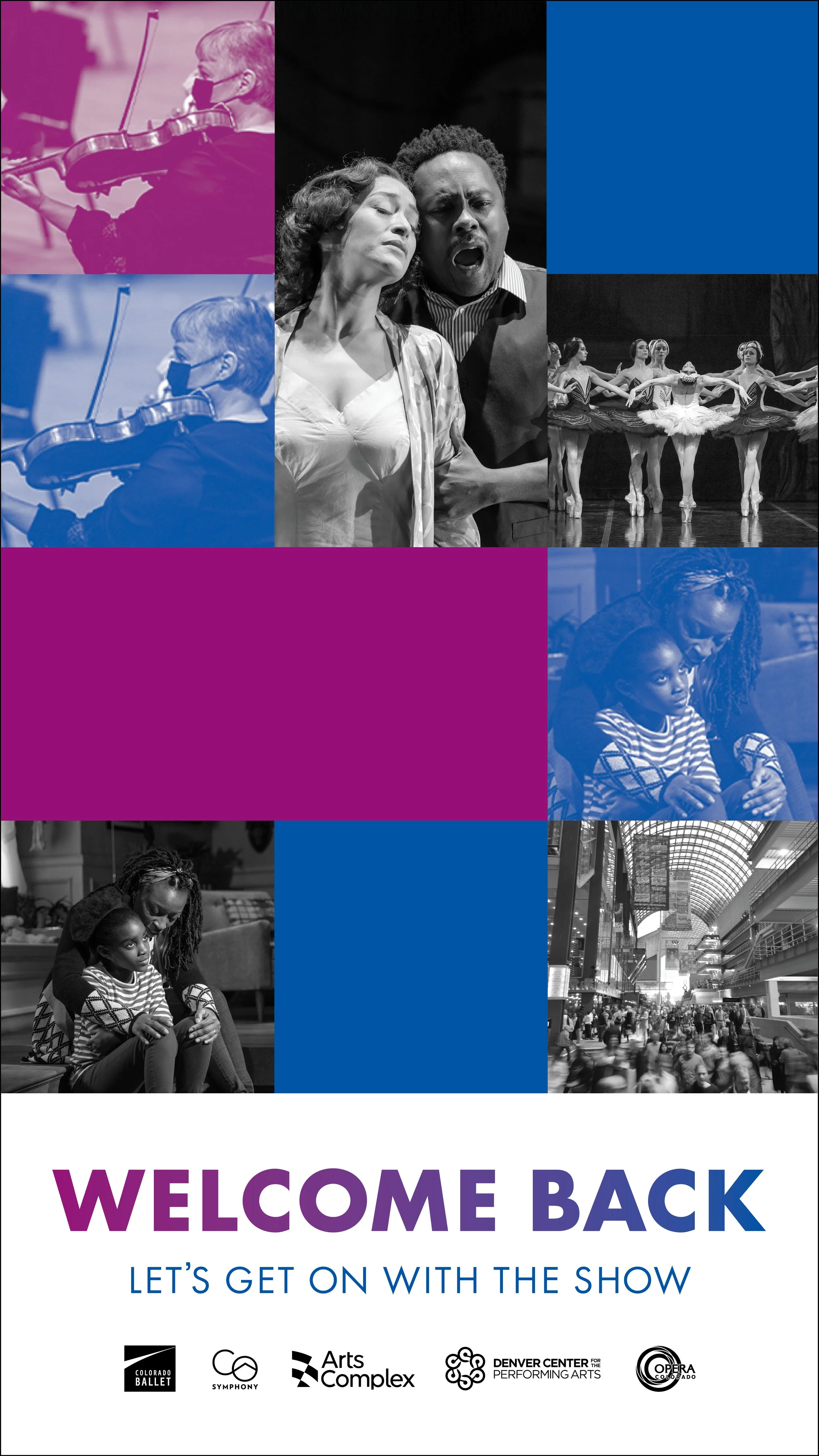
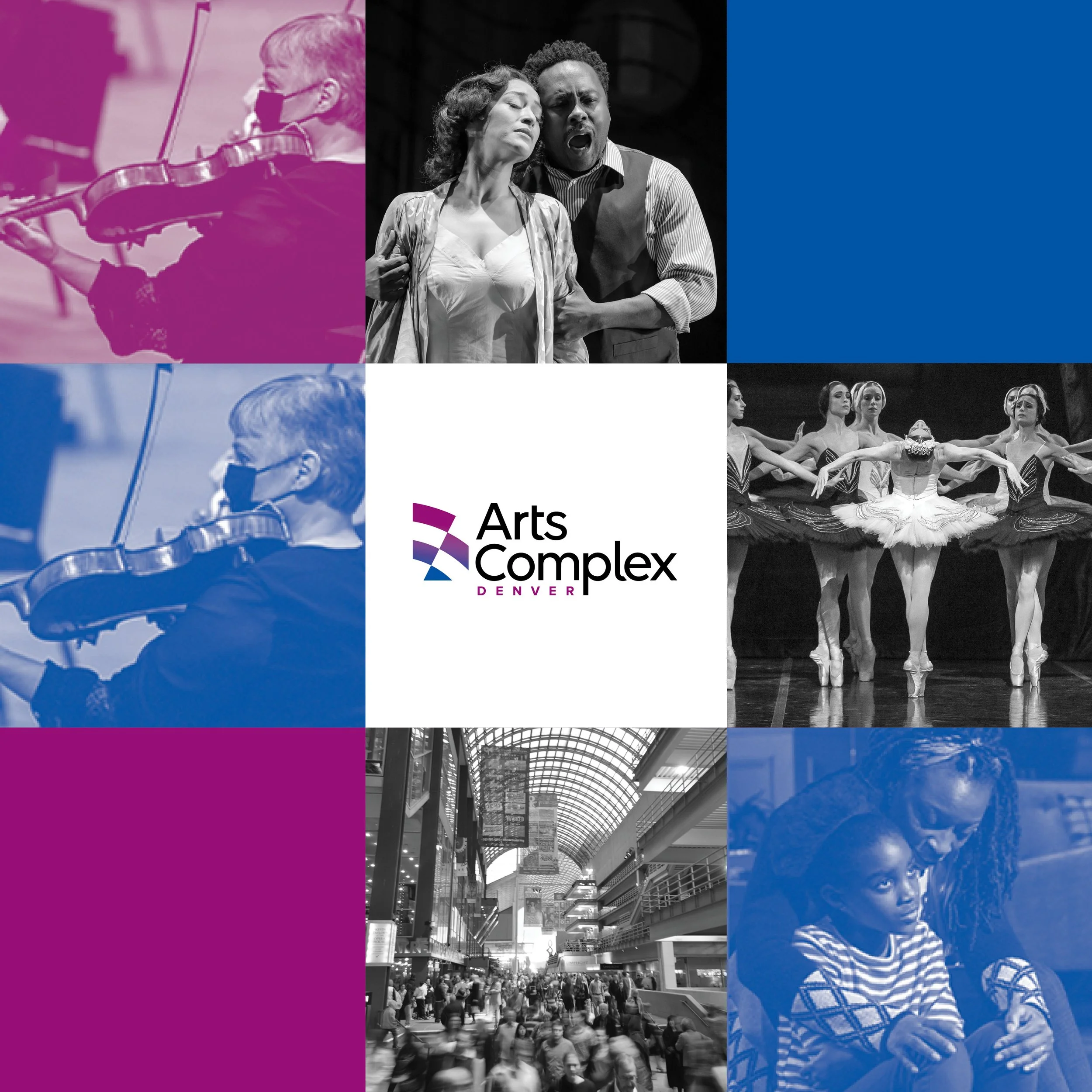
DENVER ARTS COMPLEX reopening concepts
I pitched these playful modular concepts for a “Welcome Back” campaign to safely usher Denver arts patrons back to theater, opera, dance, and symphony shows. Working with the Arts Complex’s existing blue-to-pink gradient and Futura typeface, plus a small handful of event photography, I played with simple geometric shapes and evocative photo treatments to create an energetic, modular campaign.
CAMP SUNSHINE quick-turn brand messaging, fundraising, and social
Camp Sunshine is a nonprofit organization close to my heart. It’s a fully volunteer-run summer day camp for girls living in housing projects in my hometown of Montgomery, Alabama. When I was a teenager, I worked at Camp Sunshine every year, and it’s still one of the most rewarding things I’ve ever done. In 2021, I joined the Camp Sunshine board as we tried to reinvigorate Camp Sunshine messaging — and fundraising — for a new generation. With just a few weeks before the start of camp, I created a quick Camp Sunshine brand and social presence to encourage fundraising and volunteer interest.
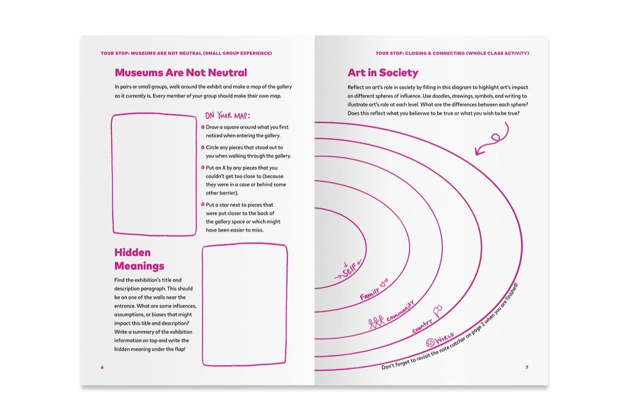
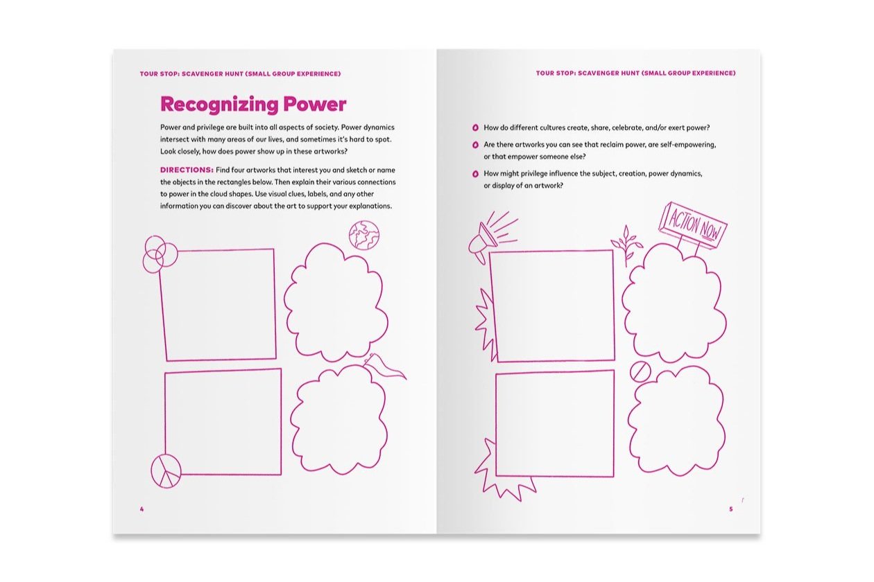
DENVER ART MUSEUM field journals
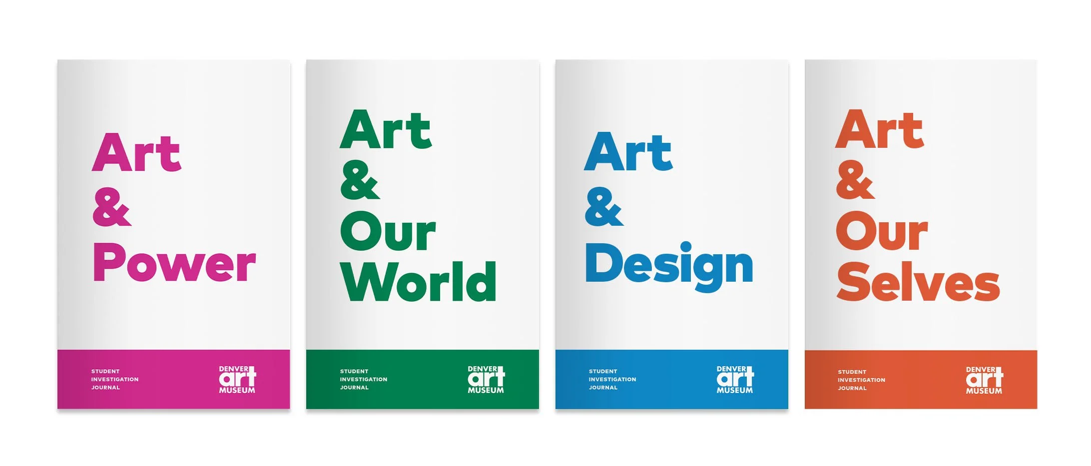
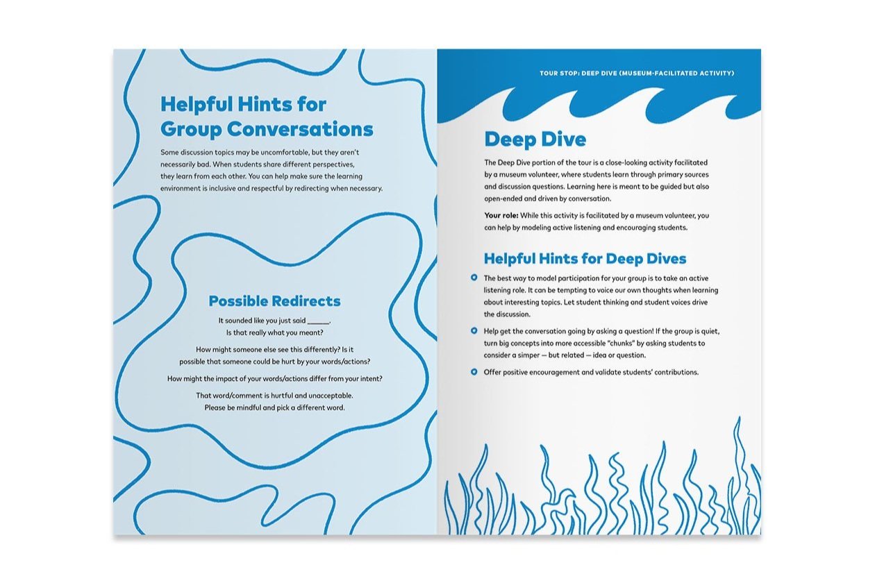
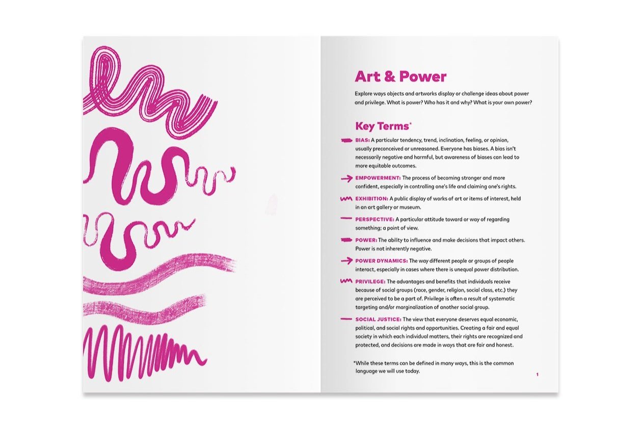
A few years after my stint as a junior designer at the DAM, I had the pleasure of working with the museum again for a freelance project with the Learning & Engagement team. L&E needed journals for student groups visiting the museum with chaperones. There were four journal themes (or art-viewing lenses) in mind — self-discovery, environment, power, and design — and each theme required a chaperone journal design and a student journal design. In total, I designed eight distinct journals with the common goal to create pieces that users would feel free to truly engage with — to doodle, mark up, dog-ear, etc. I hand-drew the doodles and annotations you see in the designs below.




fresh picked editorial DESIGN
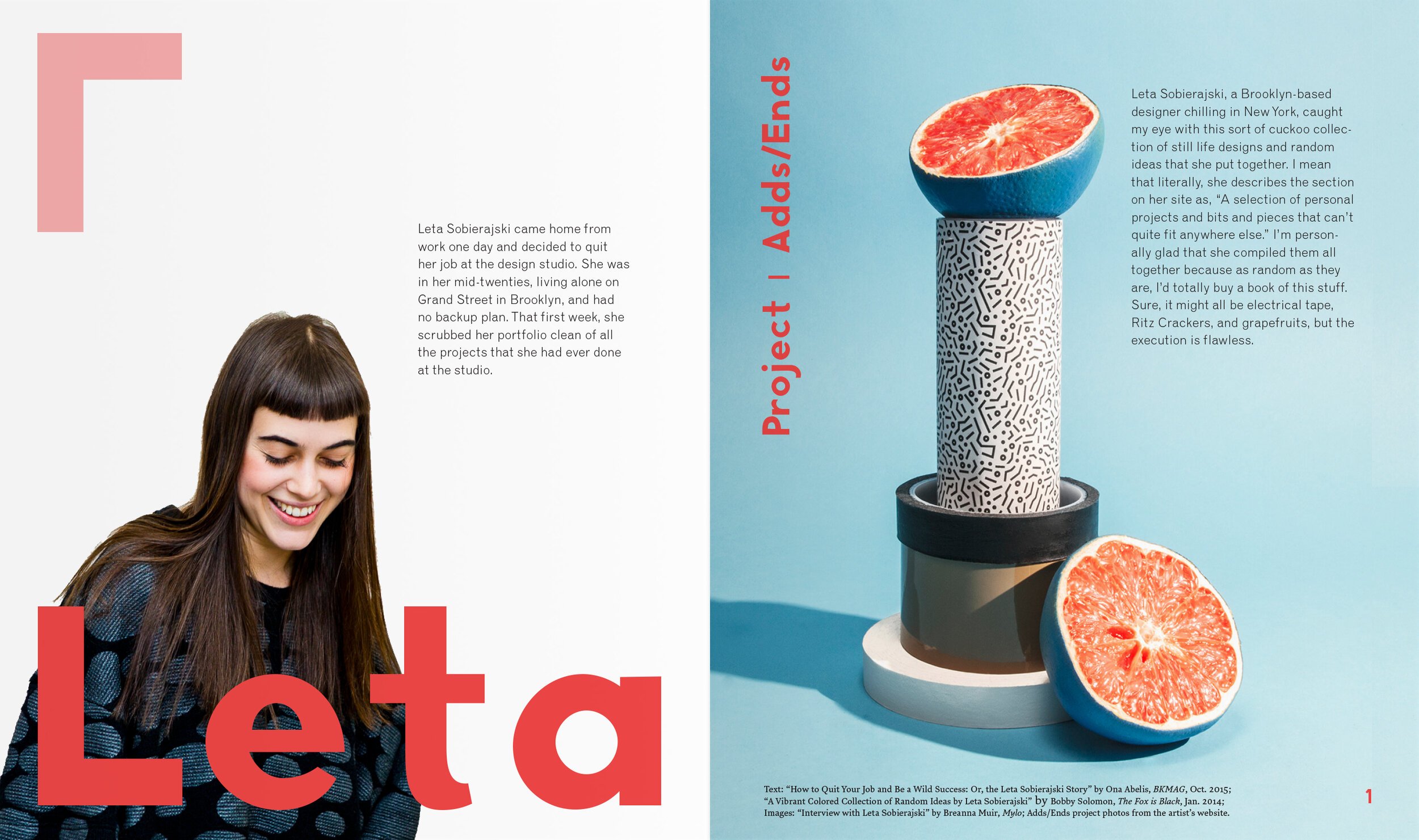
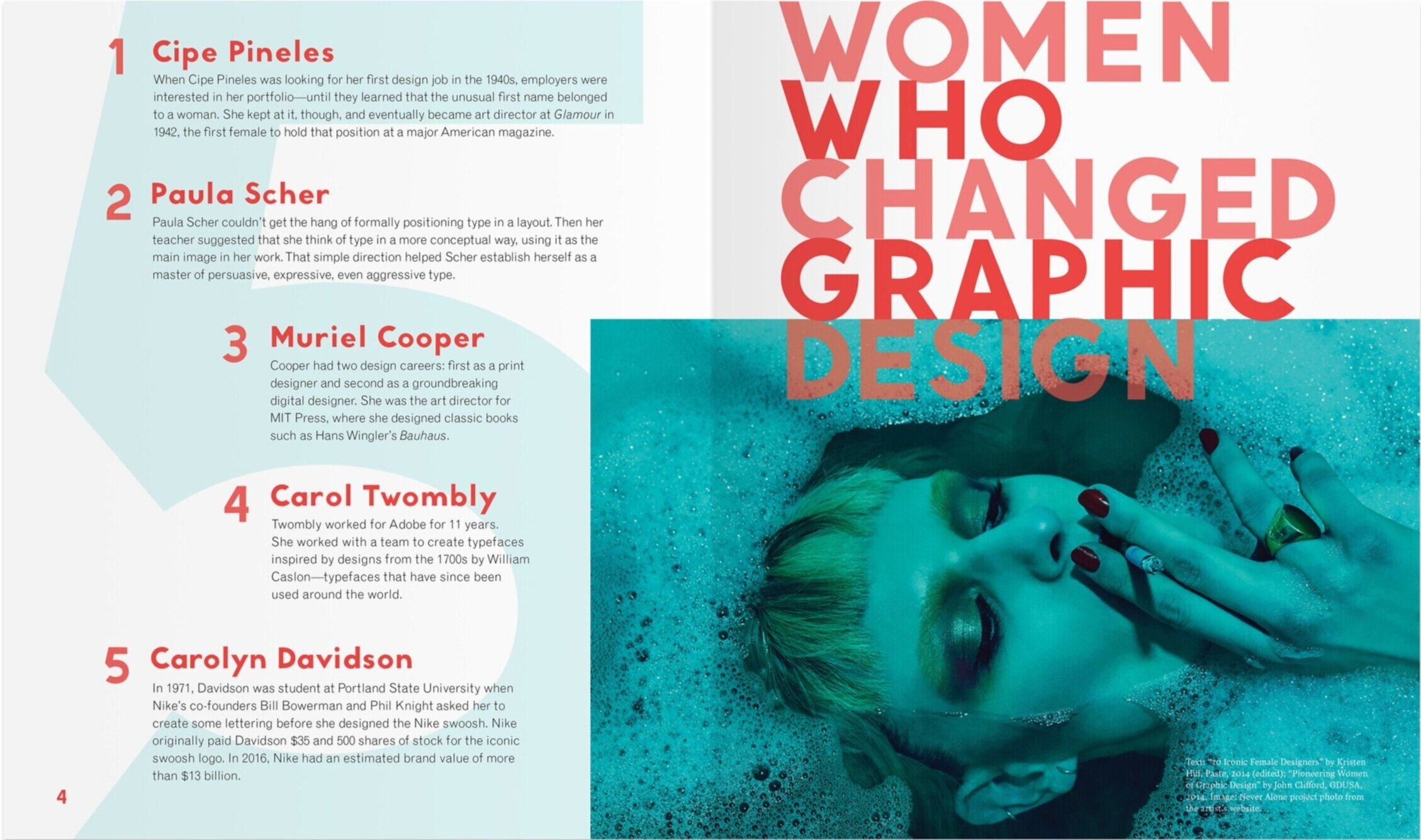
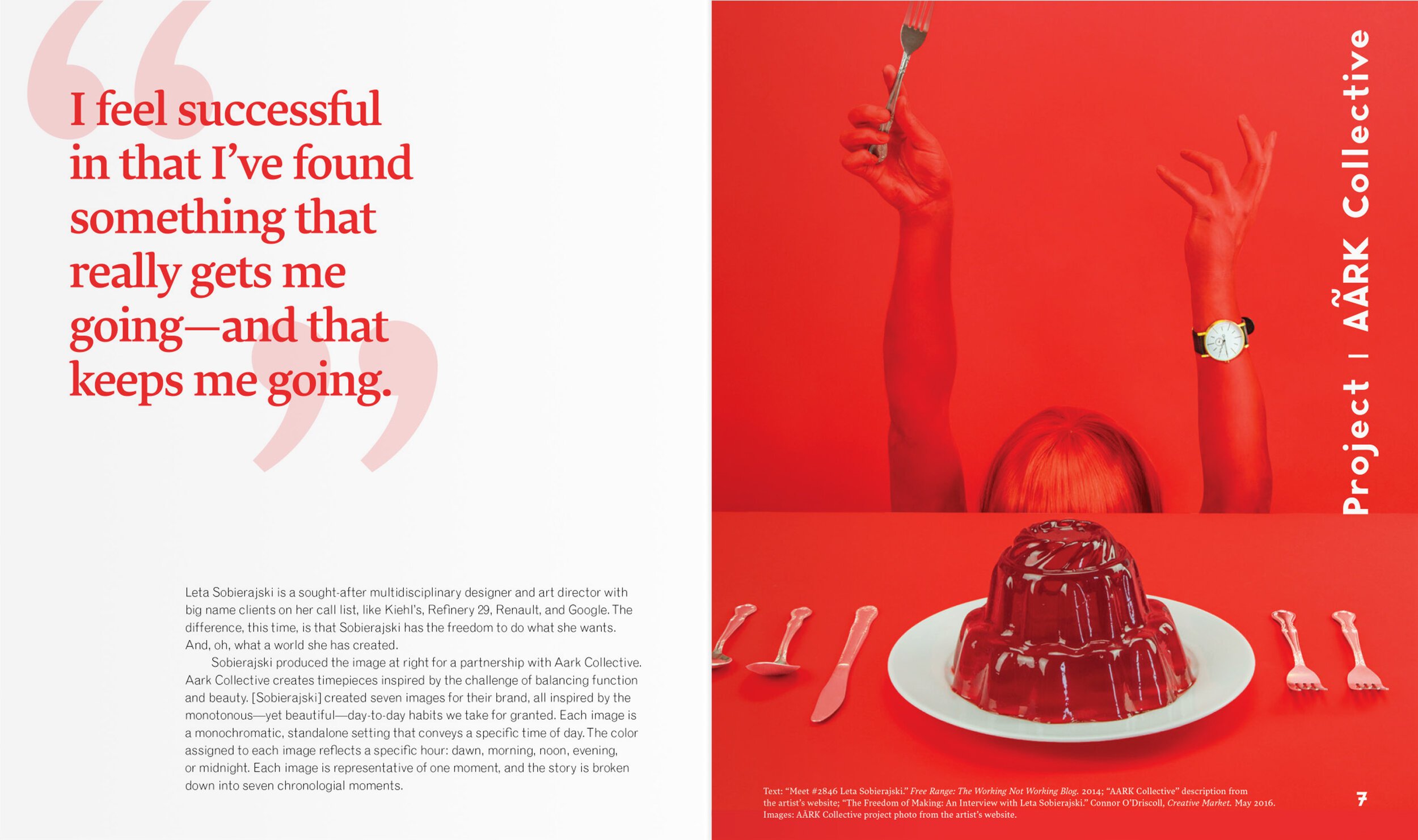
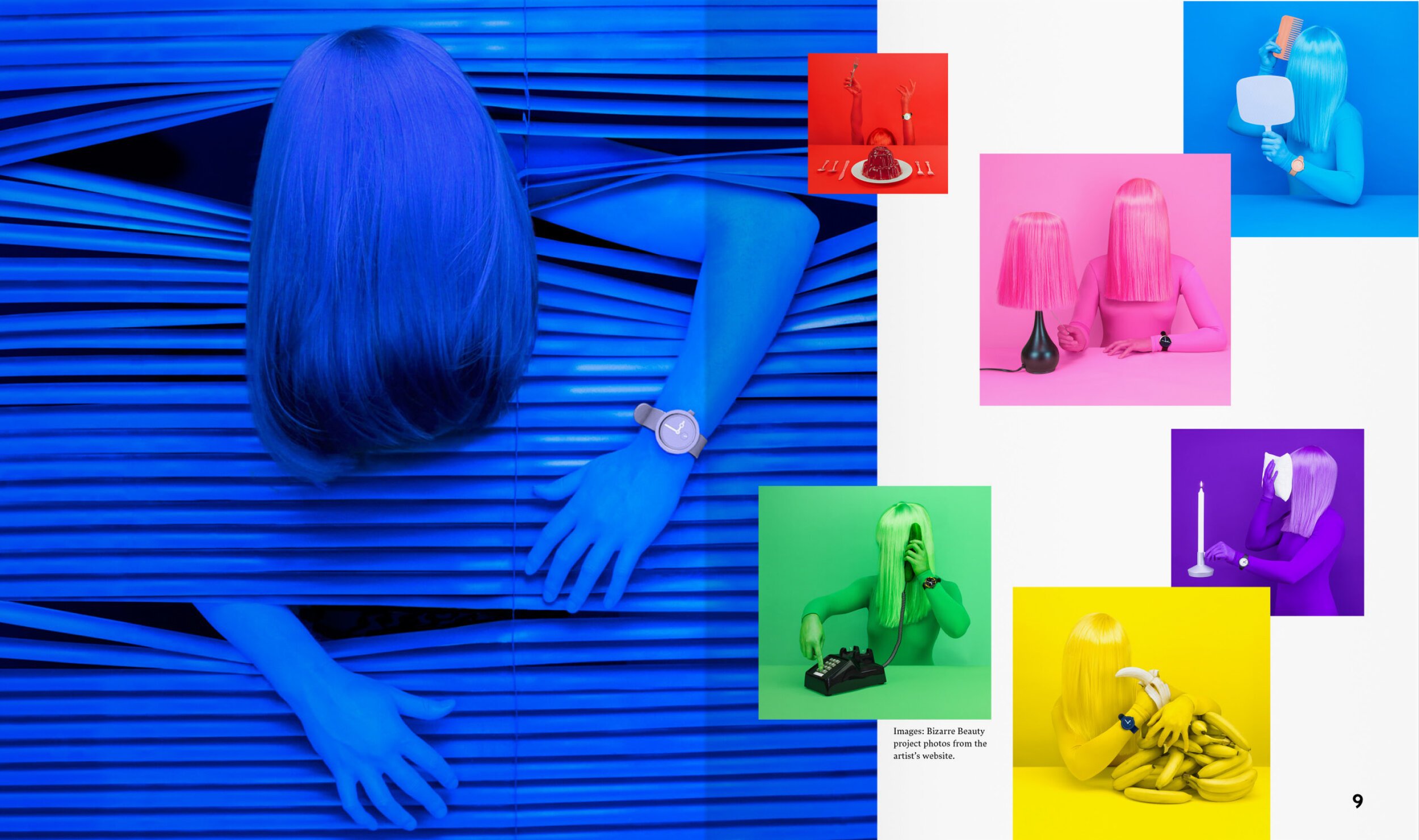
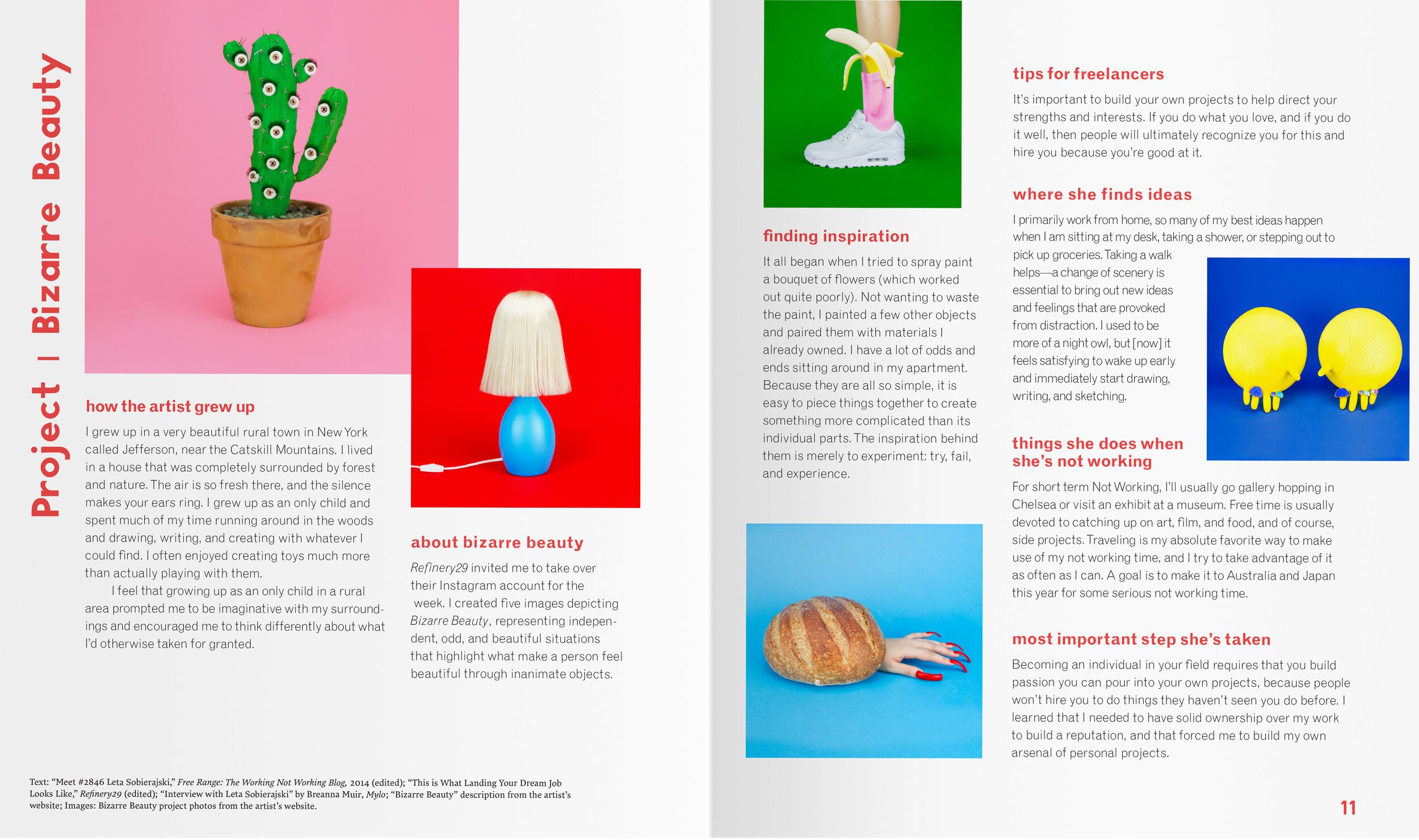
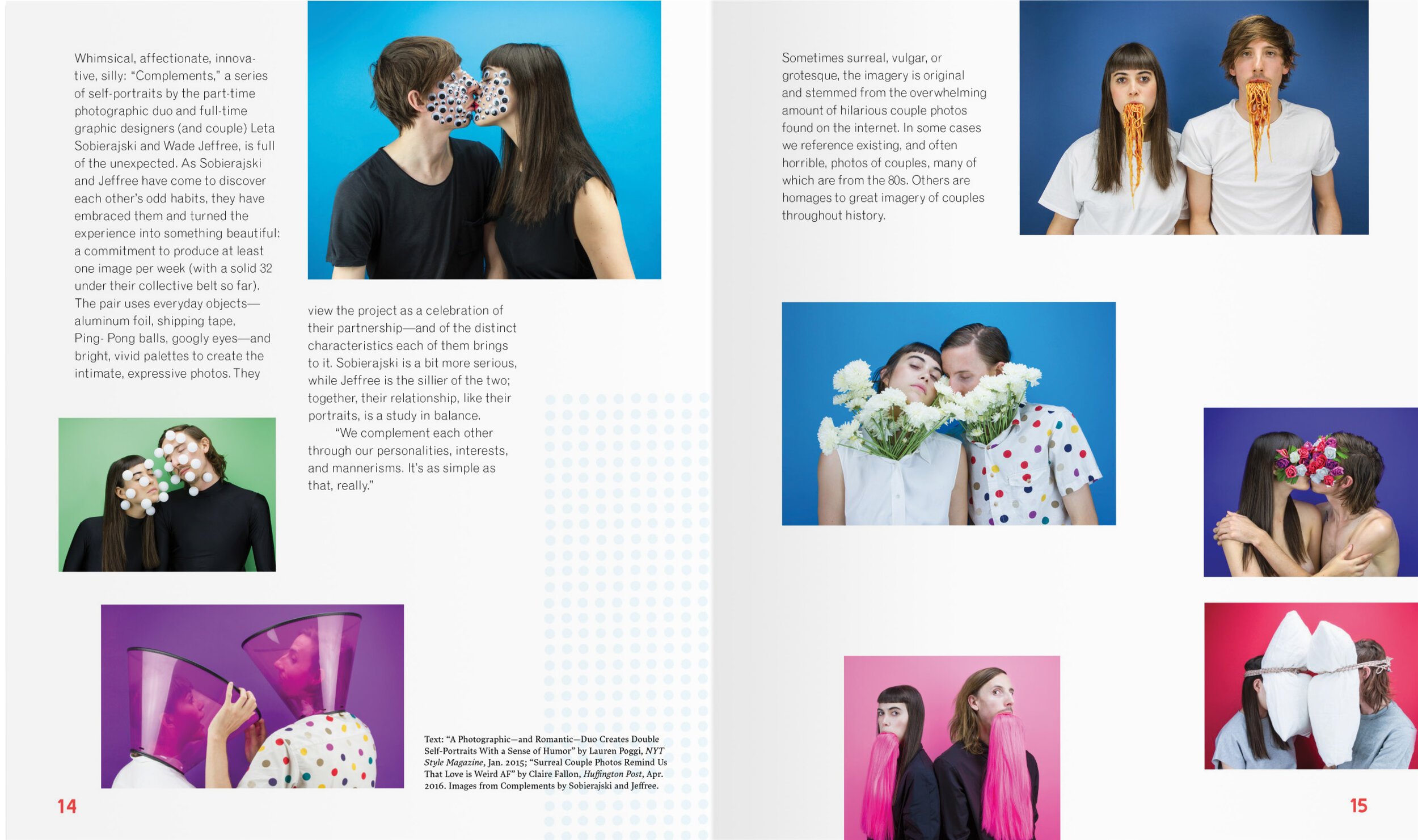
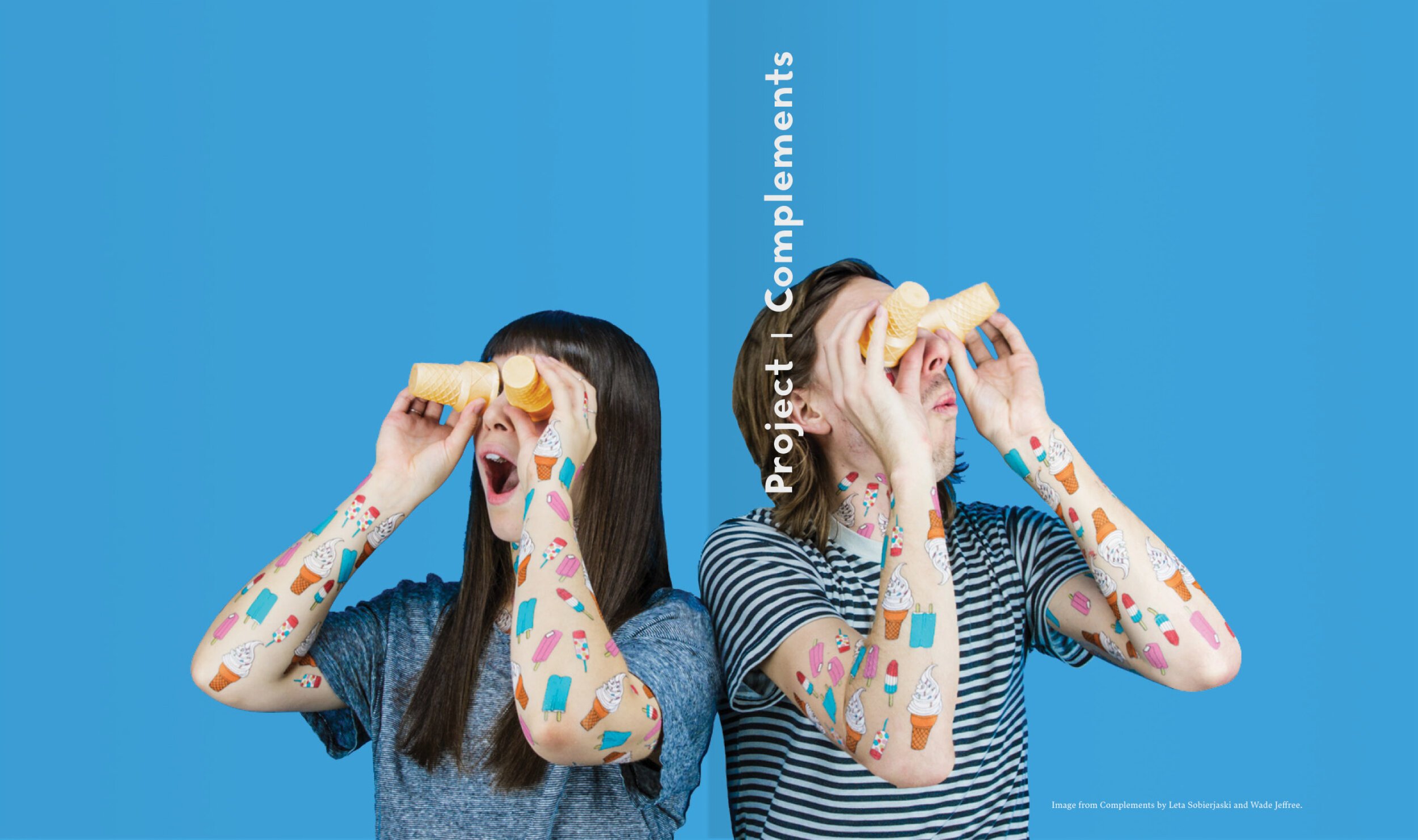
As a MICA student under the instruction of Maureen Weiss, I researched, designed, and bound this book about art director Leta Sobierajski. Leta is known for her bold, strange, and colorful style, so I adopted that same bold maximalism in my book design. About a year after I finished this project, when I was working at the Denver Art Museum, the museum hosted an AIGA Colorado talk by Leta and her partner. I met Leta, showed her my book, and talked to her over red wine about Dusen Dusen—my favorite clothing designer, who also happens to be Leta’s neighbor in Brooklyn. It’s a small world.

